Redesigning the experience of the Storylane dashboard
USP - Build killer demos in 2 minutes
A no-code platform for creating interactive product demos that captivate prospects and accelerate deal closures. With AI-powered tools, customizable flows, and analytics, Storylane empowers departments like sales, marketing teams, Growth & demand marketing executives to deliver personalized, engaging demo experiences effortlessly.
MY ROLE
Responsible for research,
conceptualization and designs (UX +UI)
TEAM
I, me & myself (since I this was
a design assignment)
WANNA HAVE SOME FUN💫?
Press the arrow button in the centre and move it left or right.
MY HONEST CONFESSION
Please don't expect to see a linear design process or any diamond/ gold design processes. I'm a also human who loves the invention of the paper & pen the most as much as I love tech & its advancement (including AI)
#ANALYSIS OF CURRENT DESIGN
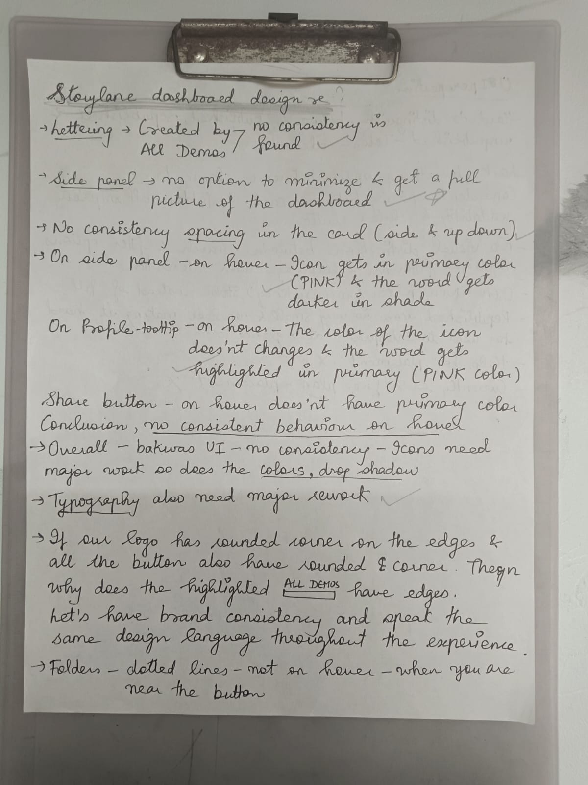
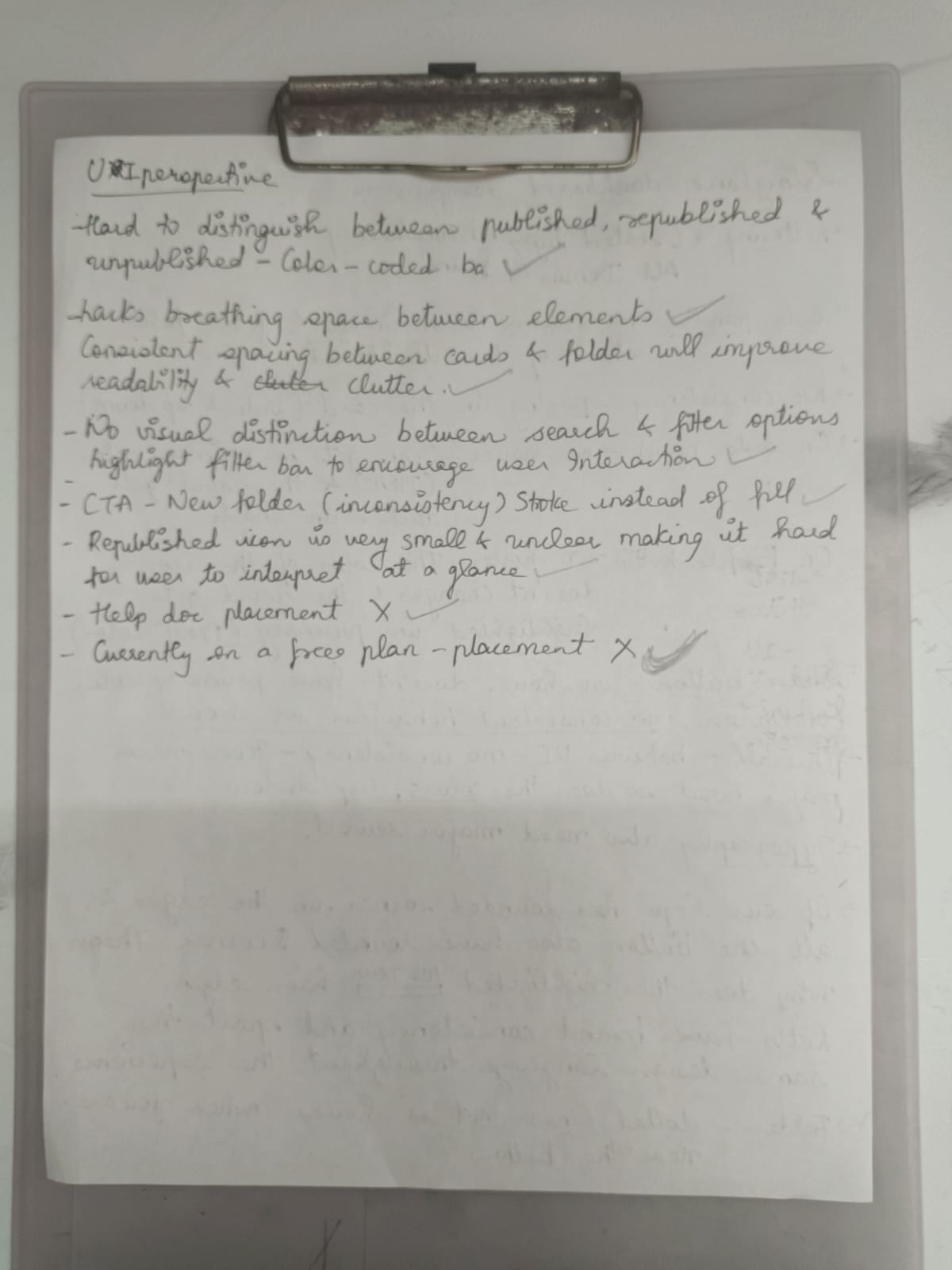
Below is the design of the current dashboard. I believe in experiencing the product firsthand & then dive deep in this screen. As it is crucial to understand the jounrey a user has taken to reach this dashboard.

CHALLENGE
Alignment, spacing, type sizes, lacks breathing space - all in all it is tough for a user to navigate as there are no consistent behavior.
SOLUTION
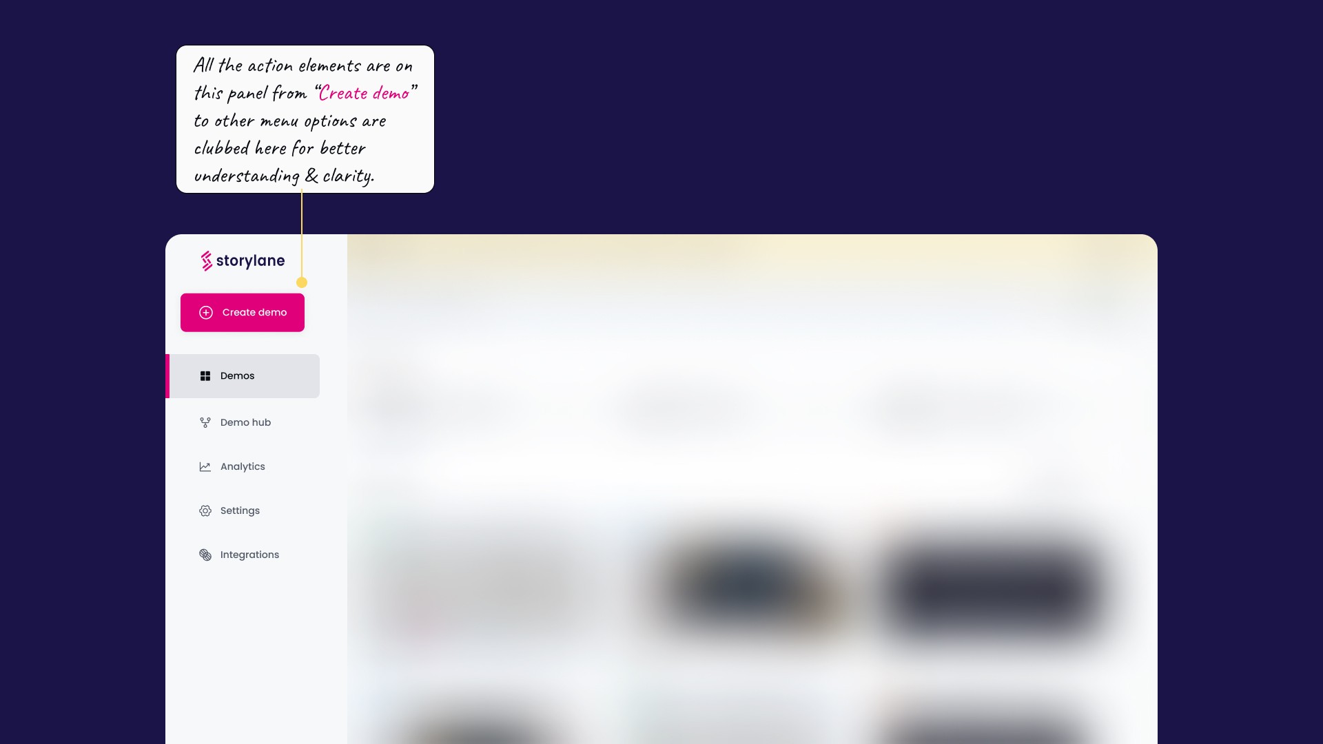
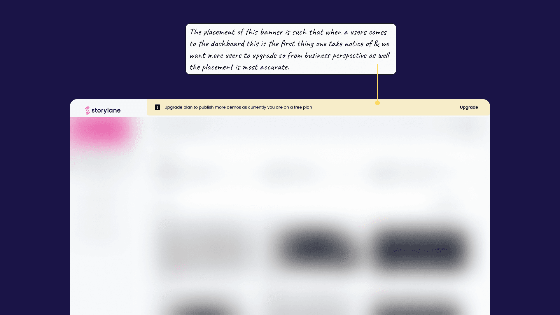
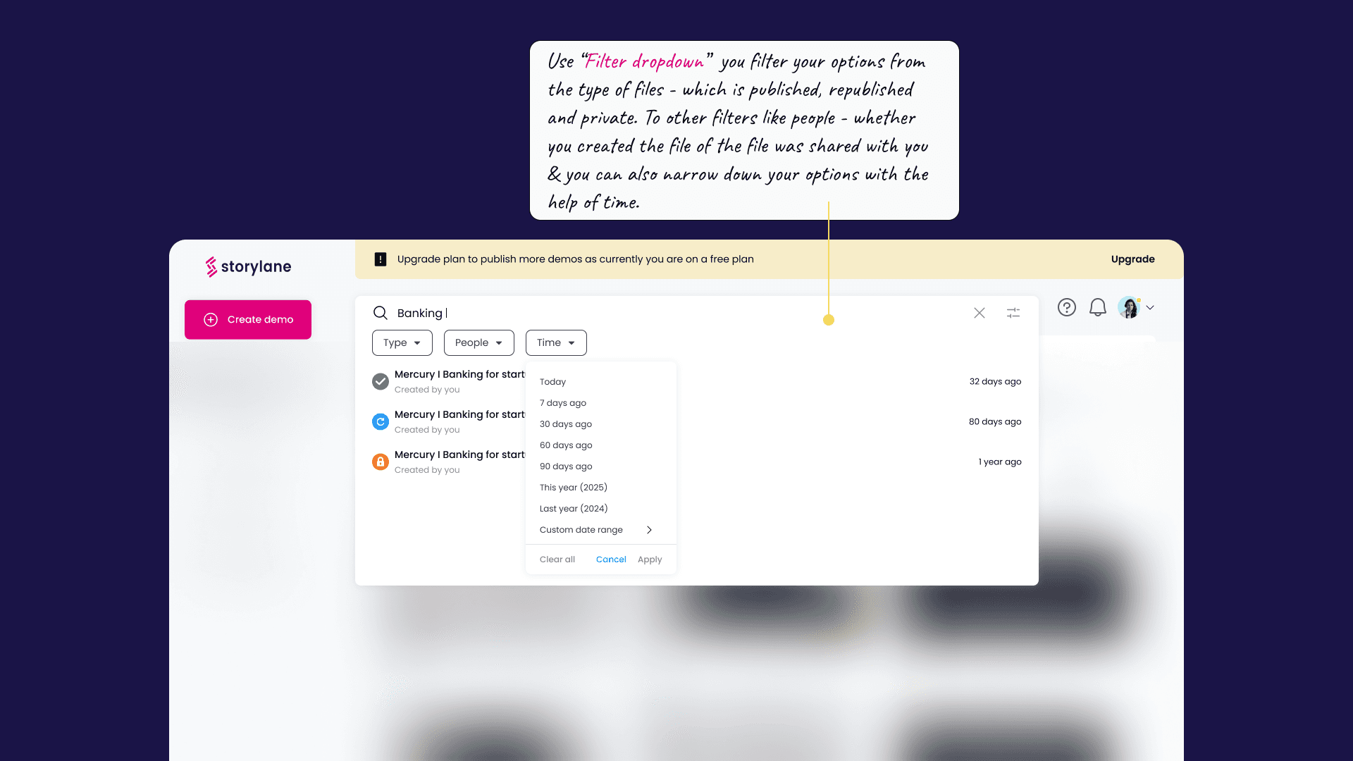
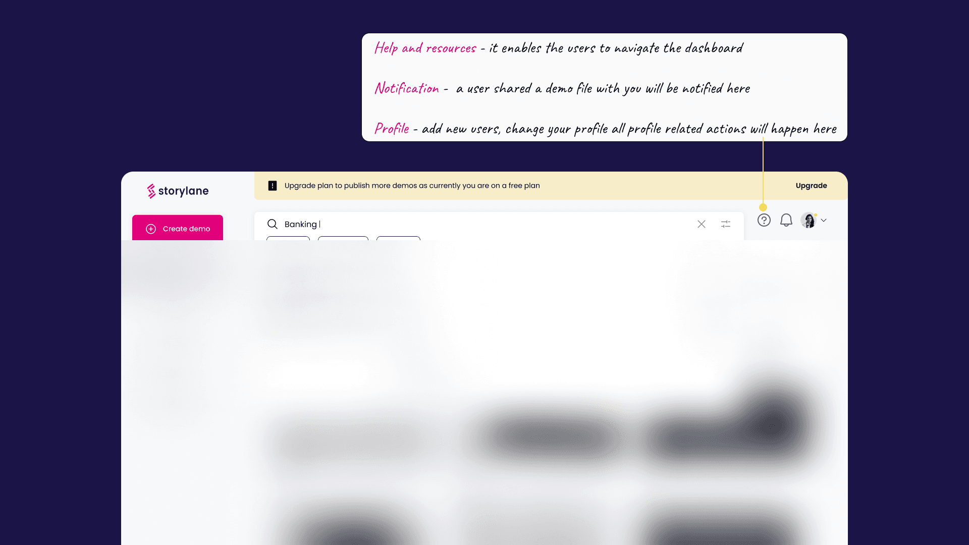
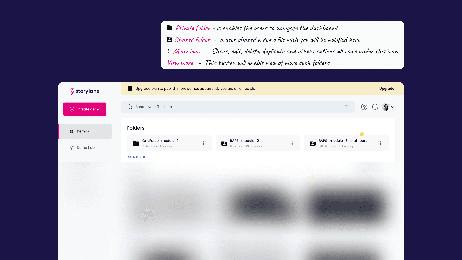
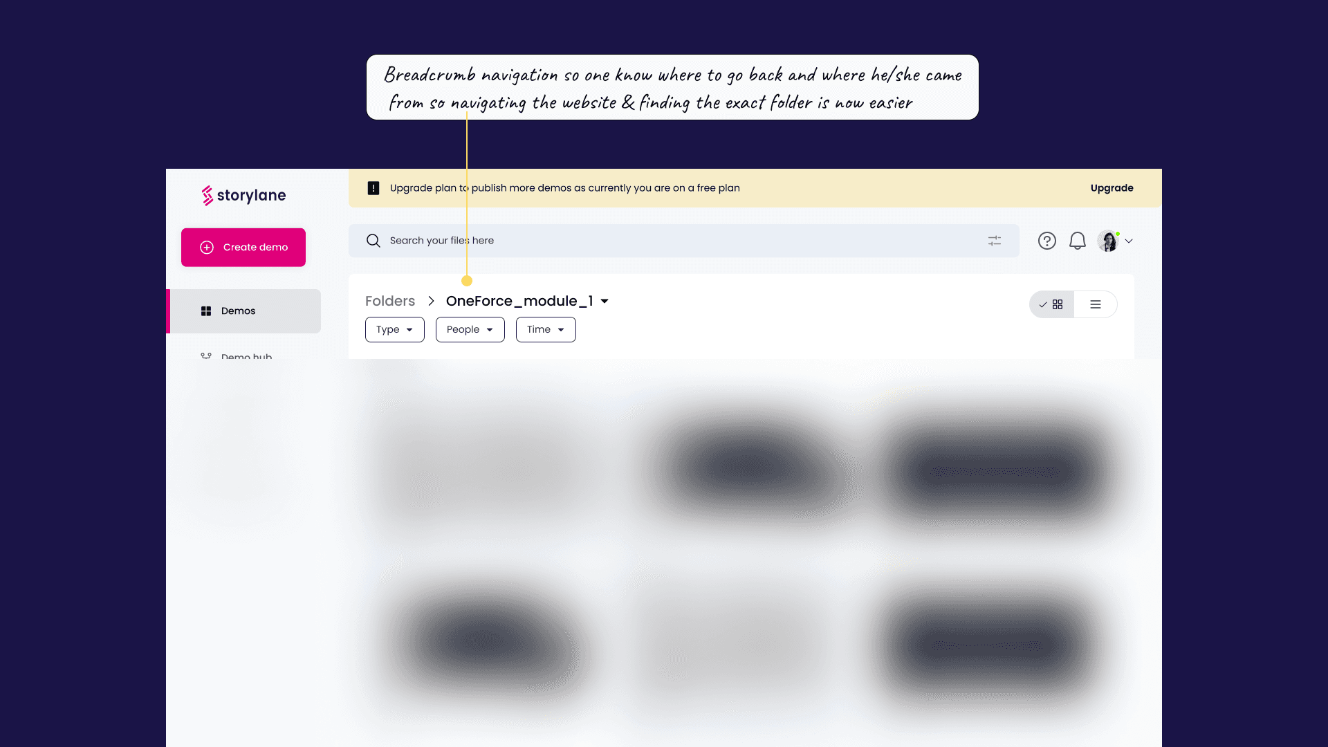
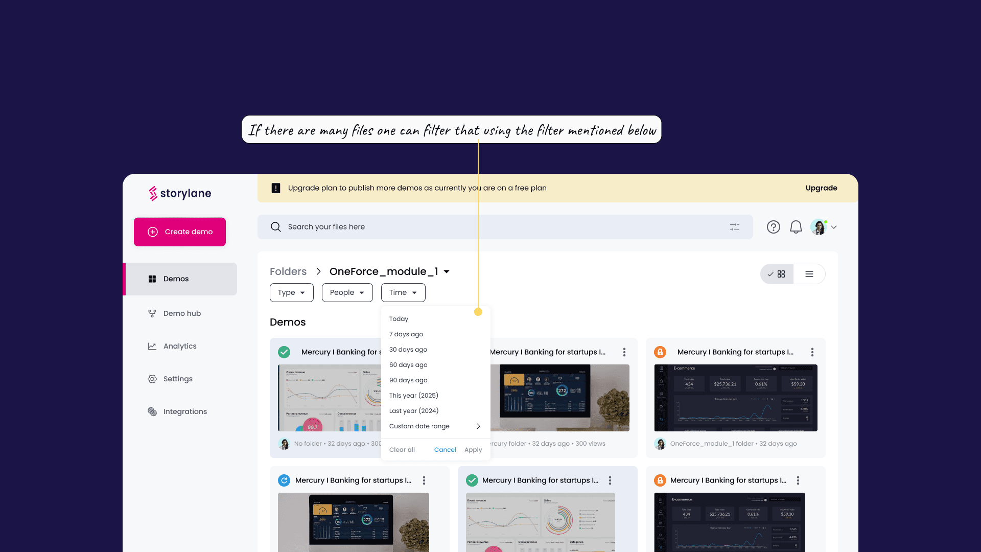
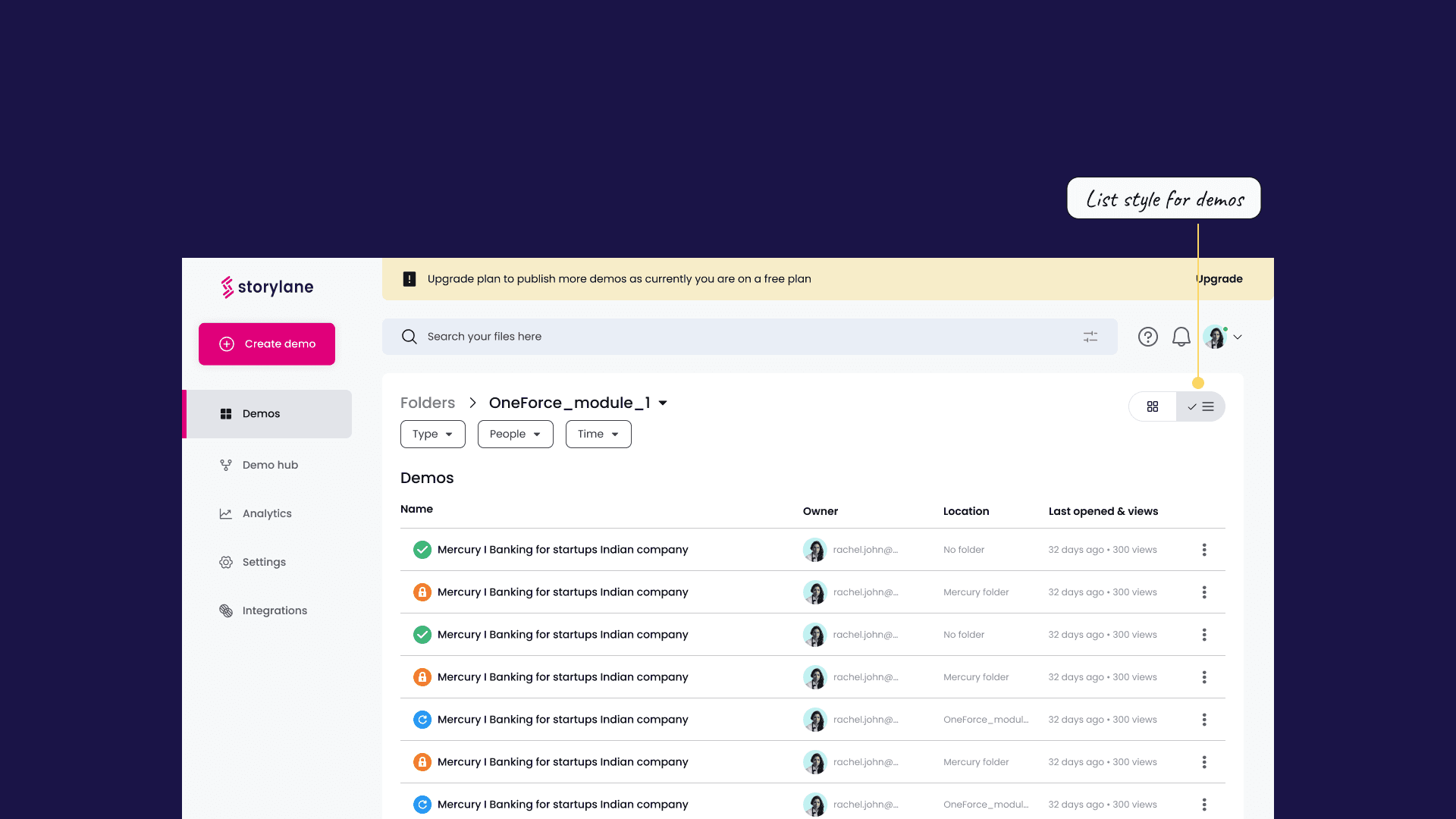
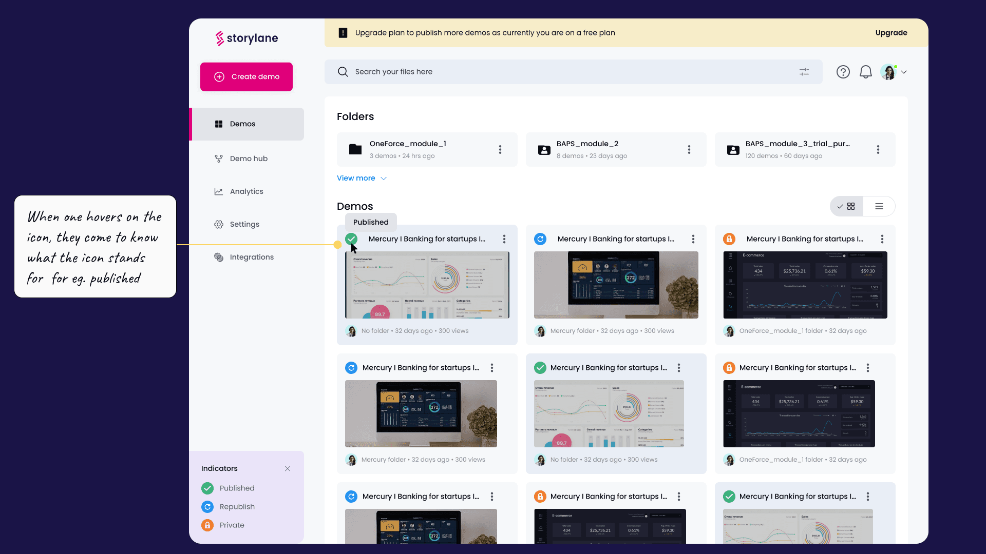
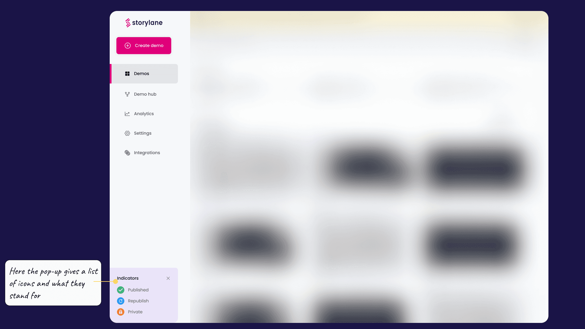
Voilaaa…!!! Here is the improved experience of the dashboard.

LET'S DIG DEEP
Let’s dissect each design decisions & their whys